

Black Friday is one of the biggest sale days of the year.
Almost everyone offers some kind of sale - products, services, coaching. Everyone wants to get in on the hype and convert some lurkers into paying customers, getting them in the door and into your product ecosystem.
As such, it’s also a big opportunity for designers to create amazing, fun, standout designs for your clients. (Yay!)
The hard part - coming up with new ways of designing the words “Black Friday” without each one looking the same. 😅
So I gathered here some Black Friday design inspo for you, and reviewed what makes them work so you can learn a thing or two along the way.
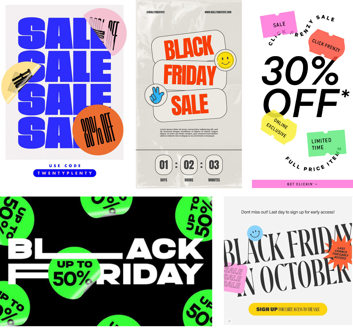
1. Trend Alert: Stickers
Want your clients to look cutting edge? Follow the trends.
Using stickers like these has become really popular lately.
They can make a simple design pop with a touch of color and a level of depth that adds dimension and action.
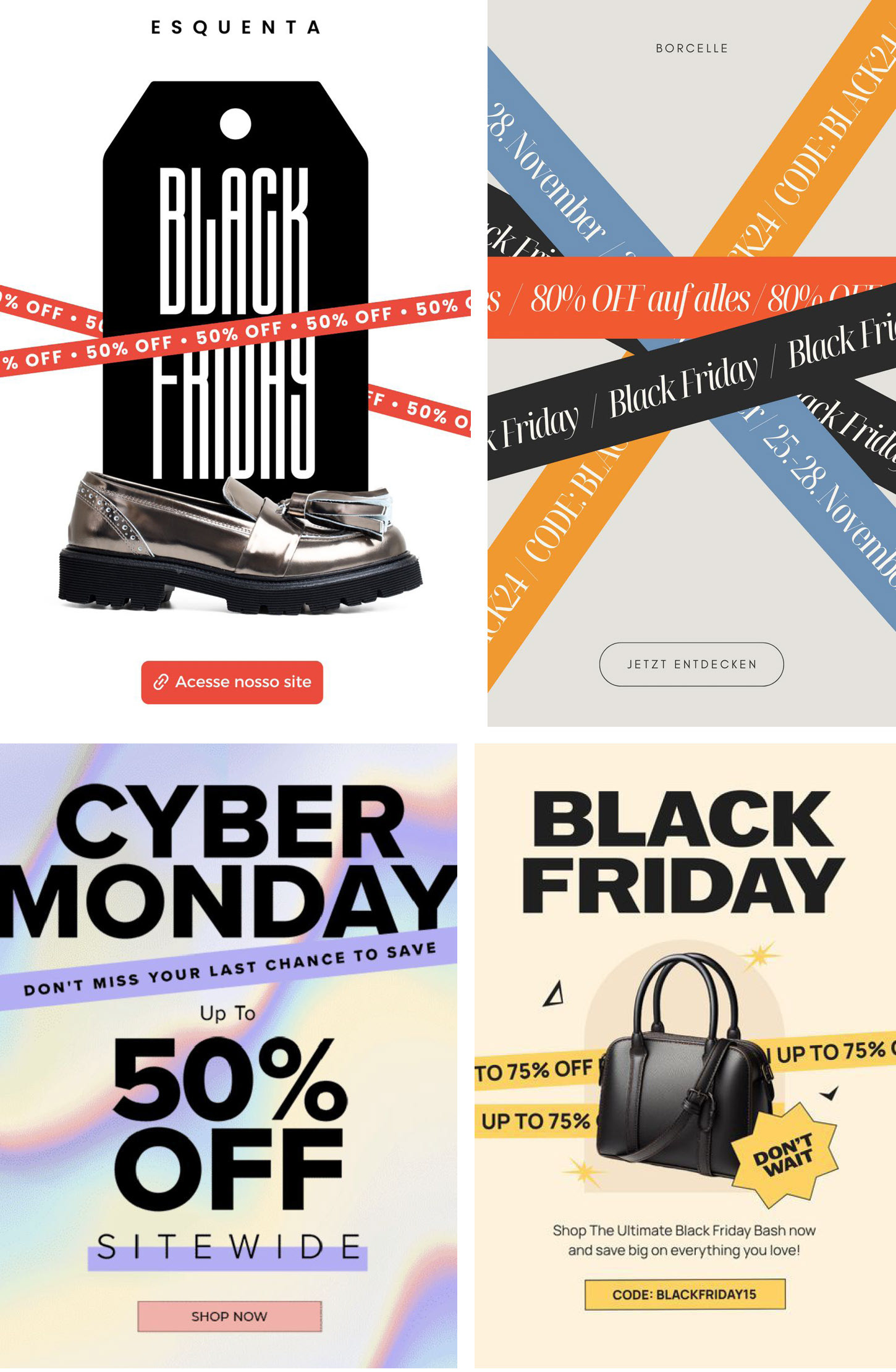
2. Trend Alert: Stripes
Another cool design element that’s trending?
These hazard-tape-looking stripes.
Also a great way to add a pop of color to a minimalist design, drawing the eye to your message.

3. Two levels of contrast
Something I think about a lot when designing is contrast.
Is there enough contrast? Does that contrast that is here look deliberate and strong enough to lead the eye?
A good rule of thumb is to always use a minimum of two layers of contrast.
Make it larger + a different color
Bolder + italics
All caps + outlined
New font + new color
New color + italics
Bolder + italics
All caps + outlined
New font + new color
New color + italics
You get the idea.
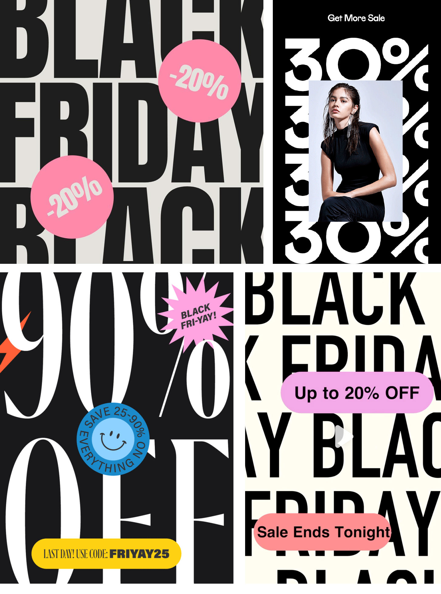
4. When in doubt, make it larger
Worried the message might not get across? Or, everything looking too similar in size, making it a bit blah?
Make it larger.
Looks big?
Double it.
Now double it again.
Looks big?
Double it.
Now double it again.
Break past the edge of the page. It’s allowed.
And it’ll make your design pop.
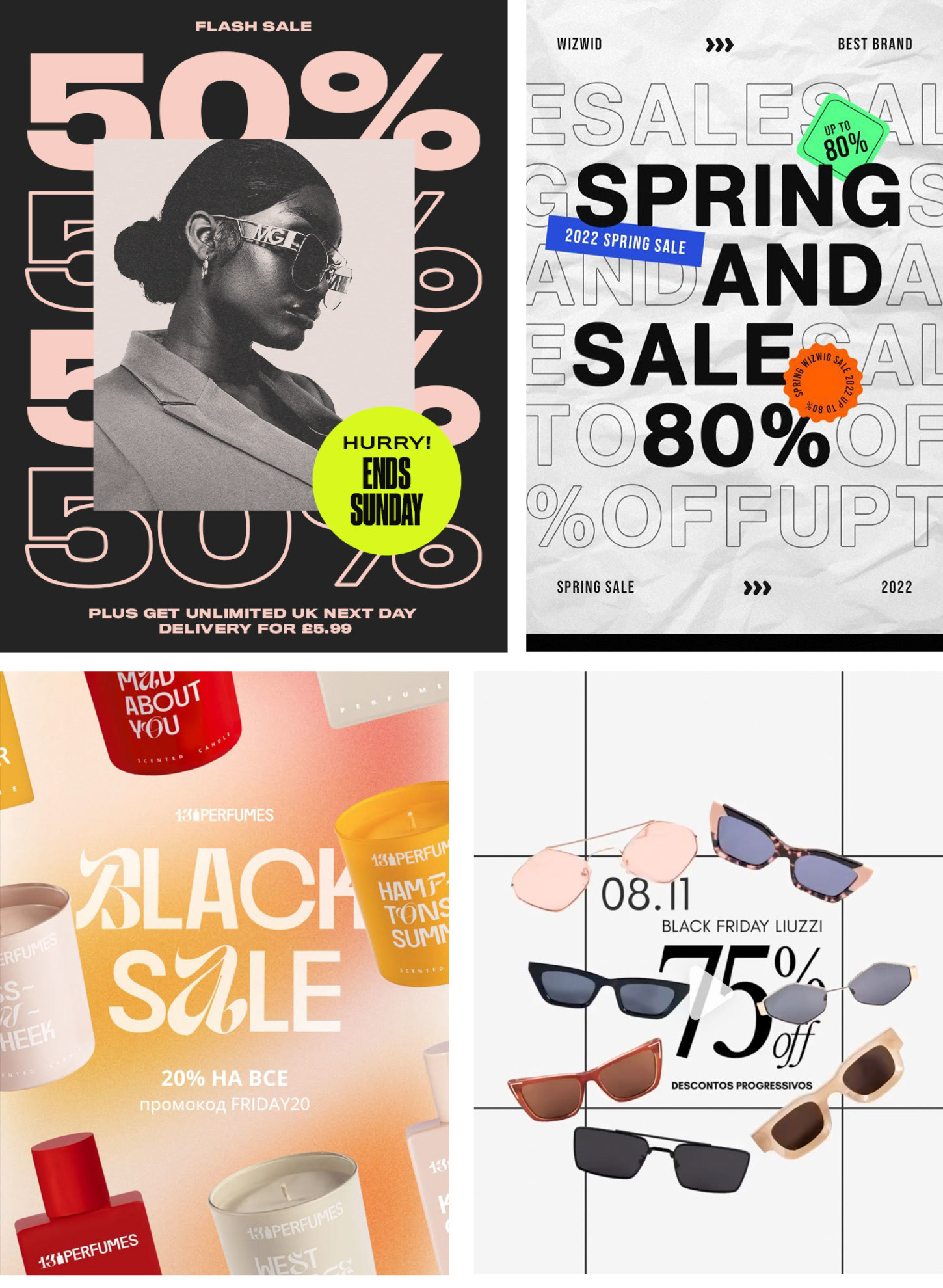
5. Create layers of depth
Your design looking a bit flat?
Overlap elements.
It creates a feeling of depth and dimension, making things more visually interesting and engaging.
This has been used in almost every design above - stickers above text, stripes both above and behind text, bubbles above text, images above text.
Everything doesn’t have to fit together like a puzzle, it can overlap like a 3D photo box.
Just be sure to overlap enough that it looks deliberate and not like a mistake. Don’t have just a few pixels touching, make it obvious.
----------
If you want to learn more, check out the extended version of this article over on Frocks in Stock.
Looking for an experienced eye to review your design?
Check out design critique for graphic designers and be in touch to get started!
Check out design critique for graphic designers and be in touch to get started!